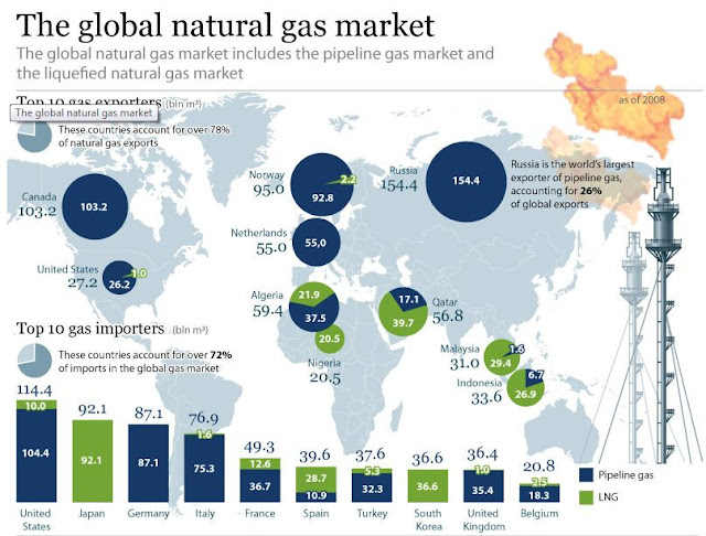
The following map from the Russian news agency Sputnik shows the larger natural gas importers. With blue you can see imports through pipeline networks, and with green imports of liquefied natural gas (LNG) through special ships. The larger exporter of gas through pipelines is Russia and the largest exporter of LNG is Qatar Russia , Canada
Map 1 (Sputnik News)
Note that the list of the top producers is different from the list of top exporters, because some countries produce a lot and consume a lot i.e. USA, and some others produce a lot but do not consume that much i.e. Russia
At the following map from the Financial Times you can see the largest importers of natural gas in 2011, after the nuclear accident of Fukushima (Japan Japan United States is included in the list of exporters, because the US exports gas to Mexico and Canada , when this is more convenient geographically, but the US
Map 2 (Financial Times)
At the following map from Indexmundi you can see the top importers of gas in 2013 (1st January 2014). You can see Russia and the Netherlands in the list, because even though they are among the top exporters they also import gas i.e. Russia from Turkmenistan and the Netherlands from UK and Norway
Image 3 Indexmundi
At the following table from the Energy Information Administration you can see the top importers of oil in 2014.
Image 4
At the following map from the American think tank Institute for Policy Innovation (IPI) you can see the top oil exporters in 2012.
Image 5
“The global natural gas market”, April 2010


Δεν υπάρχουν σχόλια:
Δημοσίευση σχολίου